Conversion · B2B commerce
The One-Page Checkout That Lifted Conversion 28.5%
How I led the redesign of Moglix’s checkout into one fast, mobile-first page, lifting conversion 28.5%, an estimated $12.5K a day in extra GMV.
Year :
2025
Industry :
B2B Commerce
Client :
Moglix
Project Duration :
4 weeks
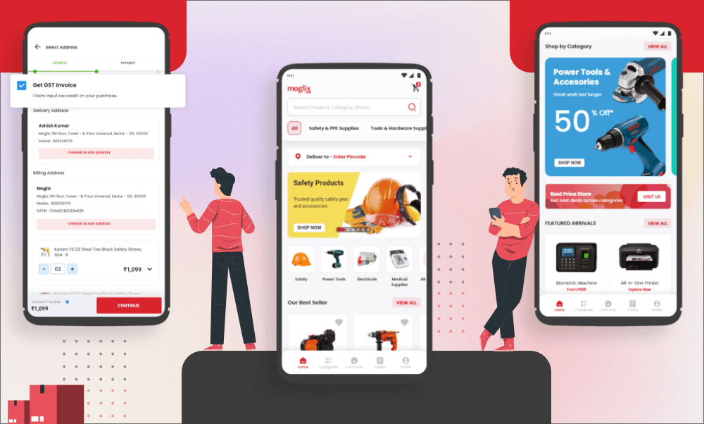
The Problem: A Checkout That Lost Buyers at Every Step
In 30 seconds: I led the redesign of Moglix’s checkout with one product designer, working with the checkout product manager and the payments engineering team. We turned a 4–5 step checkout into one mobile-first page. Over the 4 weeks after launch, checkout conversion rose 28.5%, an estimated $12.5K a day in extra GMV, and 371 failed orders were rescued in the first month.
With over 5M visits a month, checkout was Moglix’s biggest growth lever. Small amounts of friction cost real revenue. The old flow was split across 4–5 steps, coupons were hidden, failed payments ended in an error page with no way back, and the mobile experience lagged behind desktop.
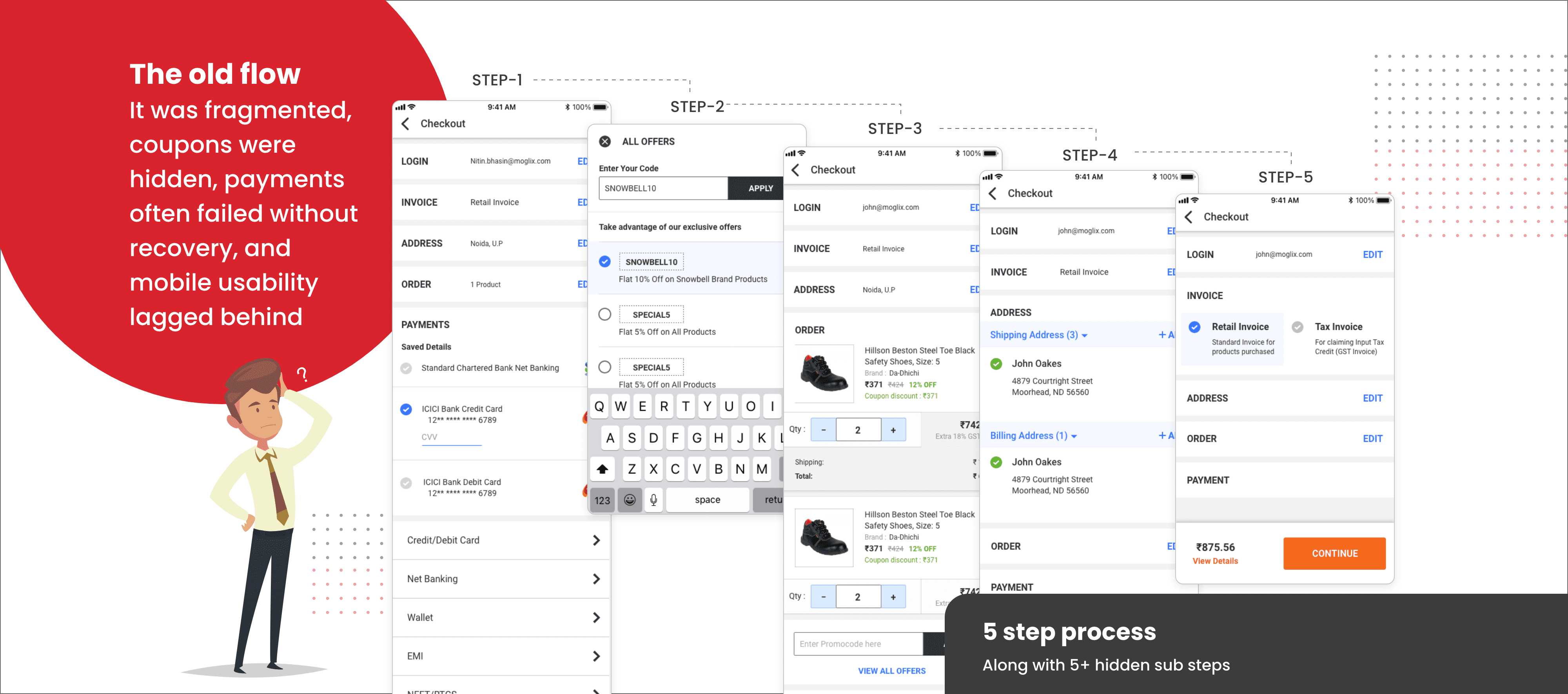
The Approach: Five Places Buyers Were Dropping Off
We audited the flow through five lenses: friction, trust, value visibility, mobile and recovery from failure. Each pointed to a specific place where buyers left.
My role was to set the direction and win agreement on it. Several of the changes went against how the business had run checkout for years, so each one had to be tied to a drop-off we could show.
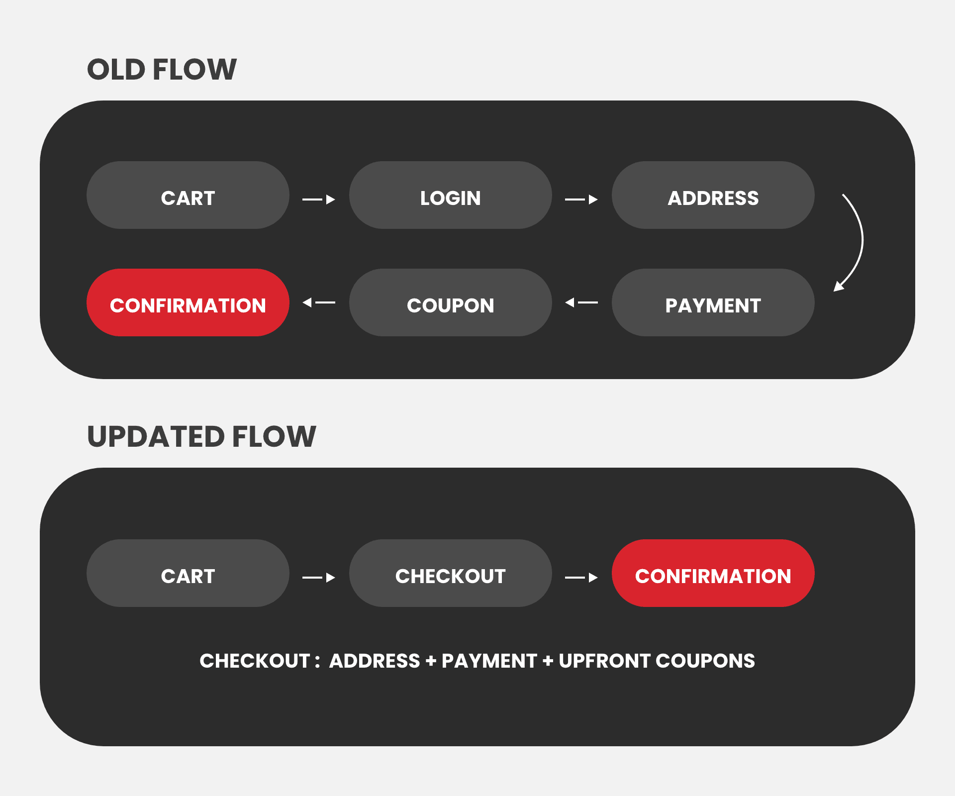

Three Decisions I Pushed For
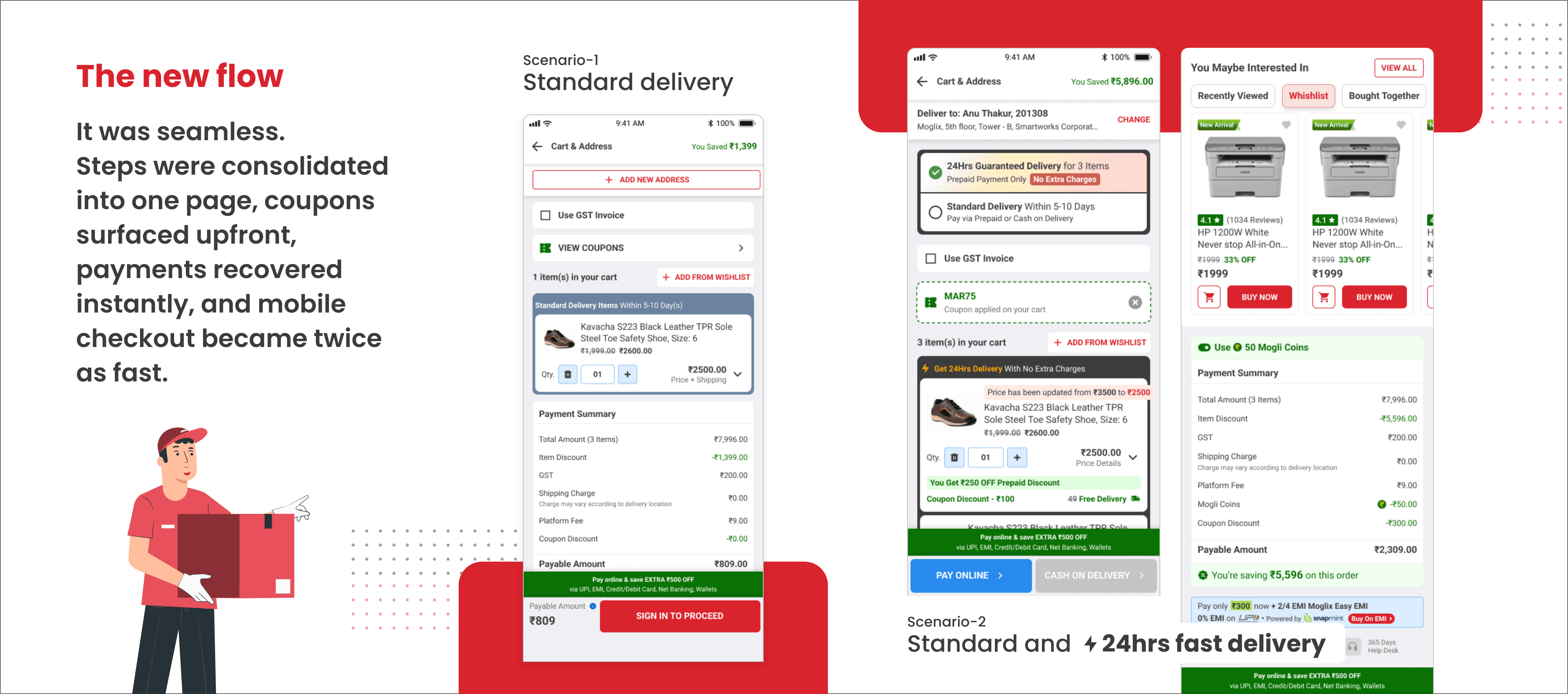
1. One page instead of several steps. Stakeholders wanted to keep the multi-step checkout. I pushed for one page because every extra step was losing buyers.
2. Coupons up front. Coupons were kept out of sight to protect margin. I moved them into the flow, because hidden savings sent buyers off the site to search for codes, and many didn’t come back.
3. Recovery instead of dead ends. A failed payment used to end on an error page. I designed a recovery popup with a retry option and alternative payment methods, so a failure became a second chance to complete the order.
The Impact
Measured by comparing the 4 weeks before launch with the 4 weeks after. No major sale or pricing change ran during that period.
Metric | Before | After |
|---|---|---|
Checkout conversion | Baseline | +28.5% |
Extra GMV | — | ~$12.5K a day (estimated from the uplift) |
Coupon redemption | Hidden | +32% |
Failed orders recovered | Lost | 371 in the first month (~$25K GMV) |
Checkout steps | 4–5 | 1 |
Mobile speed | — | 2× faster |
More Projects

Conversion · B2B commerce
The One-Page Checkout That Lifted Conversion 28.5%
How I led the redesign of Moglix’s checkout into one fast, mobile-first page, lifting conversion 28.5%, an estimated $12.5K a day in extra GMV.
Year :
2025
Industry :
B2B Commerce
Client :
Moglix
Project Duration :
4 weeks
The Problem: A Checkout That Lost Buyers at Every Step
In 30 seconds: I led the redesign of Moglix’s checkout with one product designer, working with the checkout product manager and the payments engineering team. We turned a 4–5 step checkout into one mobile-first page. Over the 4 weeks after launch, checkout conversion rose 28.5%, an estimated $12.5K a day in extra GMV, and 371 failed orders were rescued in the first month.
With over 5M visits a month, checkout was Moglix’s biggest growth lever. Small amounts of friction cost real revenue. The old flow was split across 4–5 steps, coupons were hidden, failed payments ended in an error page with no way back, and the mobile experience lagged behind desktop.
The Approach: Five Places Buyers Were Dropping Off
We audited the flow through five lenses: friction, trust, value visibility, mobile and recovery from failure. Each pointed to a specific place where buyers left.
My role was to set the direction and win agreement on it. Several of the changes went against how the business had run checkout for years, so each one had to be tied to a drop-off we could show.
Three Decisions I Pushed For
1. One page instead of several steps. Stakeholders wanted to keep the multi-step checkout. I pushed for one page because every extra step was losing buyers.
2. Coupons up front. Coupons were kept out of sight to protect margin. I moved them into the flow, because hidden savings sent buyers off the site to search for codes, and many didn’t come back.
3. Recovery instead of dead ends. A failed payment used to end on an error page. I designed a recovery popup with a retry option and alternative payment methods, so a failure became a second chance to complete the order.
The Impact
Measured by comparing the 4 weeks before launch with the 4 weeks after. No major sale or pricing change ran during that period.
Metric | Before | After |
|---|---|---|
Checkout conversion | Baseline | +28.5% |
Extra GMV | — | ~$12.5K a day (estimated from the uplift) |
Coupon redemption | Hidden | +32% |
Failed orders recovered | Lost | 371 in the first month (~$25K GMV) |
Checkout steps | 4–5 | 1 |
Mobile speed | — | 2× faster |